Day 6: #atozchallenge
Properly formatting your manuscript is essential to a writer’s success. The first rule is always to check the guidelines outlined by the agent or publisher before you submit. Below are basic formatting tips. But, be mindful, the agent or publisher may have different requirements. Adapt per their preferences.
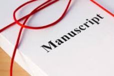
Traditional Print Formatting Tips:
- Title Page: Include your name, contact information in the upper left corner. Upper right corner – the estimated word count. Space down to center your title, double space and enter by, double space and add your name. Space three lines and begin your manuscript.
- Font: Courier 12 or Courier New 12 – this is the font most often preferred by editors; however, some editors are now accepting newer fonts – Arial or Times New Roman. Check the guidelines.
- Spacing: Double-space your manuscript – provides room for the editor to make notes and is easier on the eyes.
- Character spacing: is a single space.
- Margins: 1 inch on all sides – allows room for the editor to make notes.
- Headers: Include your name, title of the novel or keyword (all caps) and the page number.
- Chapters: Start each chapter on a new page, a third of the way down. Capitalize Chapter number and titles.
- Scene Breaks: indicate a break using the # sign in the center of the line.
- Word Count: Estimate word count by using 250 X the number of pages.
- Justification: Left justify.
- End: Designate with the # symbol in the center of the line or write, The End.
- Secure: the pages of your manuscript with a clip or rubber band.
No-No’s in Formatting:
- Do not use fanciful or colored fonts.
- Don’t number the title page. Start with the first page of the story.
- Do not place a copyright symbol © on your manuscript; it makes you look like an amateur. If your manuscript is accepted, the publisher will file a copyright in your name.
- Do not send a manuscript printed on both sides.
- Do not use word processors to determine word count; they’re not always accurate.
- Do not bind or staple your manuscript.
 For more resources of formatting check out these links:
- First Manuscript
- The Editor’s Blog
- Writer’s Digest
- Manuscript Formatting Template (Free Download)
- Short Story and Novel Formatting Templates (Free Download)
I’d love to hear your comments. Talk to me. Tell me your story and look for me on Facebook at SheilaMGood, Pinterest, Bloglovin, Twitter@sheilagood, and Contently.


Thanks for this fantastic, straight-forward advice. I’m bookmarking this! And I love Courier font. It’s what we use in screenwriting too. Though checking submission guidelines is crucial. I was applying for a grant a couple months ago, and it requested 40 manuscript pages. As I was getting it together, I noticed that the grant people wanted the manuscript to be in a sans serif font, like Arial, not a serif font, like Courier (which is what I used). And when I changed it to Arial… I lost seven pages! Yikes! I had a few extra pages written and I got it back up to 40, but still, it was a nerve-wracking experience. From now on, I’ll definitely check picky guideline requirements well before the due date. 😉
LikeLiked by 1 person
That’s a perfect example of why we check specific guidelines. All editors and agents have their preference. I’m so glad you found the information helpful. Thanks for stopping by and contributing to the conversation.
LikeLiked by 1 person
Hi, I found your blog today… not that you were lost or anything you understand, but I am pleased to be here.
There appears to be an abundance of good advice and I will be following closely from now on. Thank you for sharing and pleased to virtually meet you *waves* 😇
LikeLiked by 1 person
Same here. I’m glad you found the Cow Pasture. I was just over at your blog, loved the way your introduced yourself, especially these words: “I Bathe in love, laughter and words. Words that I read and write, words that I swallow whole.”
Welcome to the fence jumpers.
LikeLiked by 1 person
Enchanted!😇
LikeLiked by 1 person
Thanks
LikeLiked by 1 person
Reblogged this on firefly465.
LikeLike
Reblogged this on Don Massenzio's Blog and commented:
Here are some solid tips for formatting your manuscript.
LikeLiked by 1 person
Thanks Don for the reblog! I’m glad you found it helpful and worthy to share. Much obliged and thanks for stopping by.
LikeLiked by 1 person
You’re welcome. Great tips.
LikeLiked by 1 person
Reblogged this on Chris The Story Reading Ape's Blog.
LikeLike
This has turned out to be the most helpful and informative blog I’ve read during the challenge. I have to agree with everyone else, you have a knack for posting topics exactly when needed. I truly hope you parlay all of these elucidate articles into one e-book at the end of the challenge and offer it for sale at Amazon. You really should consider it. They are organized, concise, and helpful. You break each topic down to the essentials and give examples. I like that you also site other references.
Manuscript formatting has always been a touchy subject because I hear so many different answers to my questions, but you’re absolutely right, first and foremost go with what the agent or publisher requests. The scene break is the question where I find the most ambiguity. I can’t seem to find a universal answer. In the past it seems that it was customary to separate scenes with the # symbol or three *, but I’ve read more and more articles that say agents and publishers don’t require or don’t care for anything except an extra space to denote a scene. Is this true?
Thanks again for another enlightening post.
Melissa Sugar
http://melissasugarwrites.com
LikeLiked by 1 person
Thank you Melissa for your kind comments and suggestions. Like everything else, preferences change. It wasn’t too long ago, everyone wanted two character spaces at the end of a sentence. In my research I found that either is usually acceptable. But, if the publisher or agent prefers the space over symbols it is usually spelled out in their guidelines and that is where we should all look first and adapt per their preferences. If they don’t specify, I would choose the one I’m most comfortable with and be consistent. Thanks so much for joining the conversation. You are the second person to suggest I put all this into a book. I’ll think about it. Thanks.
LikeLike
Formatting is a bitch. Plain and simple, but rules are rules and formatting has a bunch. Good post.
LikeLike
Thanks Sis and I agree. 🙂
LikeLiked by 1 person
Your recent posts on how to get your work published should be gathered into a folder by all would-be writers. I am really impressed by the high quality of advice, Sheila!
LikeLiked by 1 person
Thank you Peter for such kind words and encouragement. I’m honored and certainly glad you visit so often. Much appreciated.
LikeLike
Wonderful tips, Sheila! I’ve read a few of these before, but never the one on scene separation. This is good to know! Thank you!
Many Blessings,
Lori
My A2Zs @ As the Fates Would Have It & Promptly Written
Follow Me (Ravyne) Twitter|Facebook
LikeLiked by 2 people
Lori Thanks so much. I’m glad you found them helpful and thrilled you stopped by the Cow Pasture.
LikeLiked by 1 person
Welcome, Sheila.. I will be by again soon 😀
LikeLiked by 1 person
What a great post! I had a tough time formatting mine. Everywhere you look, you are told something a little different. I finally looked for some resources at the library for help and found some great ones. This was one of the best: http://goo.gl/qlvM4L
Julianne
Ink & Stitches – http://blog.jhwinter.com
LikeLiked by 1 person
Julianne, thanks so much for the additional resource. I appreciate your kind comments. Glad you stopped by and joined the conversation.
LikeLiked by 1 person
Of course! Yours as well over on my blog. Keep the posts coming and I will keep on reading them 🙂
LikeLiked by 1 person
You betcha!
LikeLiked by 1 person
Thank you for this information. Great timing, too.
LikeLiked by 1 person
Glad you found it helpful and thanks for stopping to read and comment.
LikeLiked by 1 person
Your posts always hit me at the right time. Right now, I am preparing a short story to send out by Friday. It’s for a writing contest and requirements say to be sure our names are not anywhere on the story except for the title page that we should send in separately. But I have a quick question. I’ve heard that you shouldn’t use the # sign to separate scenes instead, you should triple space. Which is correct or are both methods corrects. Also, my manuscript is going down to the Deep South. Do they have a preference for a certain font? I was told that Times New Roman is preferable, but you are saying Courier. So what do you think? Sending it to the a contest in the Deep South, I want the formatting to be as correct as possible.
Thank you in advance for answering.
Visiting from the A to Z Blog Challenge.
Shalom,
Patricia @ EverythingMustChange
LikeLiked by 1 person
Patricia,thanks for the kind comments. From my research, the # symbol and the three * are the most often recommended ways to denote a scene, but an extra space is also acceptable (not three spaceS because you’re already double spacing). As far as font, this should be specified in the magazines/contest outline. The ones I’ve seen most preferred is Courier, Courier New, and Times New Roman. check the guidelines and you should be good.Good luck!
LikeLiked by 1 person
Thank you so much. I am really enjoying reading your most timely posts that are meeting the present needs that I have concerning writing.
Visiting from the A to Z Blog Challenge.
Shalom,
Patricia @ EverythingMustChange
LikeLiked by 1 person
I love sharing the things I’ve learned along the and love that you’re enjoying my posts and taking part in the conversation.
LikeLike